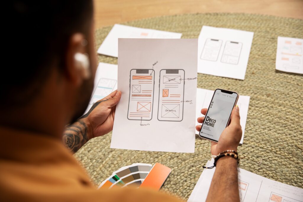
Micro interactions are the unsung heroes of exceptional user experience design. These small, functional moments—often lasting less than a second—play an outsized role in how users perceive and interact with digital products. When executed well, they transform static interfaces into dynamic, responsive environments that guide, reassure, and even delight users.

This in-depth guide explores every facet of microinteraction design, from fundamental principles to advanced implementation strategies. We’ll examine real-world examples, dissect the psychology behind effective microinteractions, and provide actionable frameworks you can apply immediately to your projects.
Understanding Microinteractions: The Building Blocks of UX
Defining Microinteractions
Microinteractions are contained, single-purpose interactions that accomplish one small task within a larger system. They typically consist of four key components:
- Trigger – The initiating event (user action or system response)
- Rules – The logic governing what happens next
- Feedback – The visible, audible, or haptic response
- Loops & Modes – How the interaction changes over time
The Psychology Behind Effective Microinteractions
Understanding why microinteractions work requires examining human cognition:
- Instant Gratification: Our brains crave immediate responses to actions
- Operant Conditioning: Positive reinforcement encourages repeated behavior
- Cognitive Dissonance Reduction: Feedback alleviates uncertainty
- Sensory Engagement: Multimodal responses create stronger memories
Microinteractions vs. Animations: Critical Differences
While related, these concepts serve distinct purposes:
| Feature | Microinteractions | Decorative Animations |
|---|---|---|
| Purpose | Functional | Aesthetic |
| Duration | Brief (ms to 1s) | Can be longer |
| Trigger | User/system action | Often automatic |
| Value | Essential UX | Optional enhancement |
The Anatomy of Exceptional Microinteractions
1. Triggers: The Starting Point
Triggers fall into two categories with distinct design considerations:
User-Initiated Triggers
- Button presses
- Form field entries
- Gestures (swipes, pinches)
- Voice commands
System-Initiated Triggers
- Notification alerts
- Background processes completing
- Error conditions
- Time-based events
Design Principle: Make triggers discoverable through visual affordances while maintaining interface cleanliness.
2. Rules: The Invisible Logic
Rules determine:
- What happens when conditions are met
- How errors are handled
- Priority of competing interactions
Example:
A shopping cart microinteraction might follow these rules:
- On “Add to Cart” click:
- If in stock → Show confirmation animation
- If low stock → Show warning animation
- If out of stock → Show disabled state
3. Feedback: The Visible Response
Effective feedback must be:
- Immediate (<100ms for direct manipulation)
- Appropriate in intensity to the action
- Multimodal when helpful (visual + haptic)
- Contextual to the user’s location in the workflow
Advanced Technique:
Use the “Goldilocks Principle” for feedback:
- Too subtle → Users miss it
- Too intense → Becomes distracting
- Just right → Noticeable but not disruptive
4. Loops & Modes: Temporal Dimensions
Loops handle repetitive aspects while modes manage state changes:
Loop Examples
- Loading indicators
- Typing indicators in chat
- Pulsing “new message” alerts
Mode Examples
- Dark/light theme toggles
- Edit vs. view modes
- Accessibility preferences
Microinteraction Design Patterns
1. Progress Indicators
Best Practices
- Use determinate indicators for known durations
- Employ skeleton screens during short waits
- For longer processes, provide:
- Time estimates
- Progress milestones
- Option to pause/background the task
2. Input Validation
Hierarchy of Responses
- Predictive (before input)
- Format hints
- Required field indicators
- Realtime (during input)
- Character counters
- Strength meters
- Post-Submission
- Field-specific error messages
- Suggested corrections
3. Notification Systems
Design Matrix
| Priority | Visual Treatment | Duration | Sound |
|---|---|---|---|
| Critical | Red, persistent | Until dismissed | Loud |
| Important | Yellow, timed | 5-8 seconds | Medium |
| Normal | Blue, subtle | 3-5 seconds | Soft |
| Low | Gray, minimal | 1-2 seconds | None |
4. Transitional Animations
Spatial Relationships
- Parent-to-child: Zooming into details
- Peer-to-peer: Swiping between cards
- Hierarchical: Drill-down navigation
Temporal Patterns
- Easing curves: Natural acceleration/deceleration
- Staggering: Sequential element movements
- Duration tiers:
- Instant (50-100ms) for direct manipulation
- Quick (200-300ms) for view changes
- Deliberate (500ms+) for major transitions
Technical Implementation Strategies
Performance Optimization
Key Metrics
- <1% main thread blocking
- <3% CPU usage per interaction
- 60fps rendering
Optimization Techniques
- Use CSS transforms over layout properties
- Implement will-change for known animations
- Debounce rapid-fire triggers
- Offload computations to Web Workers
Cross-Platform Considerations
Mobile-Specific Patterns
- Touch ripples
- Overscroll effects
- Haptic feedback tiers
Desktop Enhancements
- Hover states
- Keyboard shortcut feedback
- Window management cues
Accessibility Compliance
WCAG Requirements
- 2.3.3: Animation from interactions can be disabled
- 1.4.13: Content on hover/focus is dismissible
- 2.2.2: Paused, stopped, or hidden moving content
Implementation Checklist
- Provide reduced motion preference
- Ensure sufficient contrast for state changes
- Support keyboard-only navigation
- Include ARIA live regions for dynamic updates
Measuring Microinteraction Effectiveness
Quantitative Metrics
- Completion Rate: % of successful triggers
- Error Rate: Unintended interactions
- Engagement: Repeat usage frequency
- Performance Impact: FPS, CPU usage
Qualitative Measures
- User-reported satisfaction (CSAT)
- Perceived responsiveness (5-point scale)
- Emotional response analysis
- Usability testing observations
A/B Testing Framework
- Isolate Variables
- Animation style
- Duration
- Feedback modality
- Measure Impact
- Conversion rates
- Error rates
- Session duration
- Iterate
- Refine based on statistical significance
- Watch for habituation effects
Common Pitfalls & How to Avoid Them
1. Over-Animation
Symptoms
- User complaints about distraction
- Increased interaction costs
- Reduced content comprehension
Solution
Implement an animation budget:
- ≤3 concurrent animations
- Total animation time <1s per interaction
- Priority to functional over decorative
2. Feedback Lag
Acceptable Latencies
- Direct manipulation: <50ms
- Typing feedback: <100ms
- System notifications: <500ms
Improvement Tactics
- Optimize event handling
- Preload assets
- Implement optimistic UI
3. Inconsistent Behavior
Prevention Methods
- Create interaction design system
- Document trigger/response pairs
- Conduct regular interface audits
Future Trends in Microinteraction Design
Emerging Technologies
- AI-Powered Interactions: Adaptive responses based on user behavior
- Haptic Evolution: More nuanced tactile feedback
- Voice-Enabled Microinteractions: Conversational UI enhancements
Ethical Considerations
- Dark Patterns: Avoiding manipulative designs
- Addiction Potential: Responsible engagement design
- Accessibility: Inclusive design requirements
FAQs: Microinteraction Design
Q: How many microinteractions should a typical screen have?
A: Focus on quality over quantity. Most screens need 3-5 core microinteractions for primary actions.
Q: Should microinteractions be customizable by users?
A: For frequently used products, consider offering:
- Animation speed adjustment
- Feedback intensity settings
- Modal preferences
Q: How do you test microinteractions effectively?
A: Combine:
- Usability testing for discoverability
- A/B testing for performance impact
- Eye tracking for attention patterns
Q: What tools are best for prototyping microinteractions?
A:
- Figma/ProtoPie for high-fidelity prototypes
- Framer for advanced animations
- Principle for timeline-based interactions
Conclusion & Implementation Roadmap
Microinteractions represent the polish that separates good products from great ones. By applying the principles outlined here, you can create interfaces that feel alive, responsive, and considerate of user needs.
30-Day Improvement Plan
- Audit existing microinteractions
- Prioritize 3-5 high-impact opportunities
- Prototype refined interactions
- Test with real users
- Measure performance impact
- Document standards for consistency
Remember: The best microinteractions go unnoticed while making the experience feel effortless. Focus on subtlety, responsiveness, and user needs to create truly exceptional interactions.

