

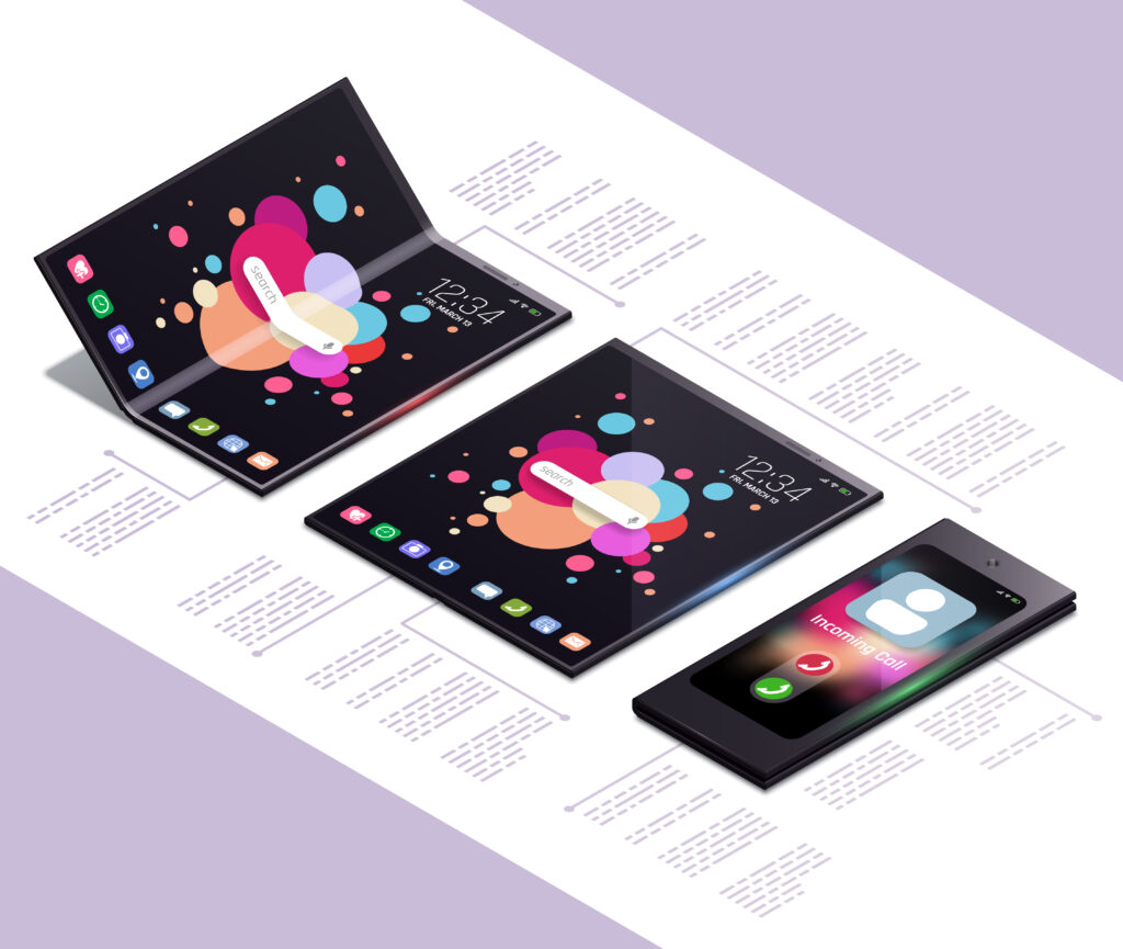
Foldable phones represent one of the most significant shifts in mobile device design since the introduction of touchscreens. Unlike traditional smartphones with fixed displays, foldable devices can transform between compact and expanded states, offering users more screen real estate when needed. This flexibility introduces new challenges and opportunities for app developers.
Building apps for foldable phones requires a deep understanding of responsive design, multi-window support, and hardware-specific considerations like hinge placement and screen durability. This guide provides a comprehensive, step-by-step approach to developing apps that deliver seamless experiences across all foldable devices.
Understanding Foldable Phone Technology and Its Impact on App Development
How Foldable Screens Work
Foldable phones use flexible OLED displays, which differ from traditional glass-based screens in several key ways:
- Polymer Substrates: Instead of rigid glass, foldable screens use thin plastic layers that can bend without cracking.
- Advanced Hinge Mechanisms: Devices like the Samsung Galaxy Z Fold and Microsoft Surface Duo incorporate precision hinges that allow smooth folding while protecting the display.
- Dynamic Screen Resolutions: When unfolded, the screen may double in size, requiring apps to adapt to new aspect ratios instantly.
Why Foldable Phones Change App Development
Unlike standard smartphones, foldables introduce:
- Multiple Display States: Phones can be fully folded, partially folded, or fully unfolded, each requiring different UI adjustments.
- Multi-Window Usage: Users expect to run multiple apps side-by-side, similar to a tablet experience.
- Hinge Obstruction: The physical hinge can split content, requiring careful UI placement.
Developers must account for these factors to ensure apps function correctly in all scenarios.
Designing Apps for Foldable Phones: Best Practices
1. Implementing Responsive and Adaptive Layouts
Foldable apps must dynamically adjust to different screen sizes. Key strategies include:
- ConstraintLayout (Android) & Auto Layout (iOS): These tools help UI elements resize and reposition automatically.
- Fragment-Based Design: Breaking the UI into modular fragments allows smoother transitions between folded and unfolded states.
- Dynamic Grid Systems: Adjust column counts based on available screen space to prevent cramped or stretched content.
2. Handling Screen Continuity and State Changes
When a user unfolds their phone, the app should transition seamlessly without reloading. Solutions include:
- Multi-Resume Support (Android): Ensures apps stay active when switching between folded and unfolded modes.
- onConfigurationChanged(): Override this method to manually adjust layouts when the screen changes.
- WindowManager APIs: Detect folding postures and adjust UI elements to avoid hinge obstruction.
3. Optimizing for Multi-Window and Multi-Tasking
Foldable phones encourage users to run multiple apps simultaneously. Your app should:
- Support Split-Screen Mode: Ensure UI components don’t break when resized.
- Enable Drag-and-Drop: Allow data transfer between app instances (e.g., dragging images from a gallery to a messaging app).
- Adjust Keyboard Behavior: If the screen splits, the keyboard should resize to avoid covering input fields.
4. Avoiding Common UI Pitfalls
- Don’t Place Critical Buttons Near the Hinge: Users may struggle to tap elements blocked by the fold.
- Test Different Aspect Ratios: Some foldables have square-like screens when unfolded, unlike traditional 16:9 or 19:9 phones.
- Optimize Typography: Fonts should scale appropriately—too small on a large screen hurts readability.
Development Tools and Frameworks for Foldable Apps
1. Android’s Foldable-Specific APIs
Google has introduced several tools to simplify foldable development:
- Jetpack WindowManager: Detects hinge location, folding posture, and screen states.
- OnDeviceTesting in Android Studio: Simulates folding behavior on emulators.
- Multi-Window Enhancements: Improved support for drag-and-drop and split-screen layouts.
2. Testing on Real Foldable Devices
While emulators help, real-world testing is essential. Recommended devices:
- Samsung Galaxy Z Fold Series (covers book-style foldables).
- Samsung Galaxy Z Flip Series (clamshell-style foldables).
- Microsoft Surface Duo (dual-screen testing).
3. Cross-Platform Solutions (Flutter & React Native)
If you’re not building native apps, ensure your framework supports foldables:
- Flutter: Use
MediaQueryandLayoutBuilderto adapt to dynamic screen sizes. - React Native: Experimental libraries like
react-native-foldablehelp detect folding states.
Common Challenges and How to Solve Them
1. App Crashes When Resizing
Some apps force-close when switching between folded and unfolded states. Fixes:
- Avoid hardcoded pixel values—use
dporspunits. - Test
onSaveInstanceState()to preserve app state during transitions.
2. Hinge Interference with UI
If content appears split by the hinge:
- Use
WindowManagerto exclude hinge areas from interactive zones. - Design flexible margins that adjust based on screen posture.
3. Performance Optimization for Foldables
Larger screens demand more GPU/CPU resources. Optimize by:
- Reducing background processes when in multi-window mode.
- Using hardware-accelerated animations for smoother transitions.
FAQ: Frequently Asked Questions
Q: Do I need to build a separate app version for foldables?
A: No, but your app must support responsive layouts and multi-resume functionality.
Q: How can I test foldable behavior without owning a device?
A: Use Android Studio’s emulator with foldable configurations.
Q: Are iOS apps affected by foldable screens?
A: Not yet, but iPadOS apps should prepare for possible future foldable iPads.
Q: What’s the biggest mistake developers make with foldable apps?
A: Assuming one layout works for all states—apps must adapt to folded, unfolded, and partial postures.
Conclusion: Building Future-Ready Foldable Apps
Foldable phones are here to stay, and developers must adapt their strategies to accommodate these devices. By focusing on responsive layouts, multi-window support, and hinge-aware designs, you can create apps that provide seamless experiences across all foldable form factors.